
Your website might look great, but if visitors can’t find what they need in a few clicks, they’ll leave. For many New Zealand small business owners, this is a silent killer of leads and sales. Poor site architecture, the way your pages are organised and connected, is often the hidden culprit behind high bounce rates and frustrated customers. The good news? You don’t need to be a tech expert to fix it. This guide breaks down what site architecture actually is, why it matters for Kiwi businesses, and exactly what you can do to improve it today.
Table of Contents
- What is site architecture and why does it matter?
- Key methodologies for organising your website
- Best practices: building user-friendly structure and navigation
- Site architecture for better SEO and conversions
- Practical steps for Kiwi small businesses to get started
- Why strong site architecture is a game changer for NZ small businesses
- How Virtual Innovation can help elevate your website
- Frequently asked questions
Key Takeaways
| Point | Details |
|---|---|
| Keep it simple | A clear, shallow structure makes your site easier to use for all customers. |
| Prioritise user needs | Organise menus and pages based on what your real customers look for. |
| Boost discoverability | Good architecture improves your search engine ranking and increases traffic. |
| Easy first steps | You can audit and refine your website’s structure even with basic tools and knowledge. |
What is site architecture and why does it matter?
Site architecture is the way all the pages on your website are structured and linked together. Think of it as the floor plan of a building. A well-designed floor plan means visitors walk straight to what they need. A confusing one means they wander, get frustrated, and leave.
For small businesses, why websites matter goes beyond just having an online presence. Your site needs to guide customers from their first visit to taking action, whether that’s calling you, booking a service, or making a purchase.
“Site architecture impacts navigation, efficiency, and user engagement on websites.”
When your structure is clear, customers make decisions faster. When it’s messy, they bounce. It really is that simple.
Here’s what good site architecture delivers for your business:
- Streamlined navigation so customers find what they need without thinking too hard
- Better SEO because search engines can crawl and understand your pages more easily
- Higher customer satisfaction leading to more enquiries and repeat visits
- Lower bounce rates because visitors stay engaged longer
- Easier site management for you and your team as your business grows
The core building blocks of solid architecture include your main menu, topic clusters (groups of related pages), and breadcrumb navigation (the trail that shows users where they are on your site).
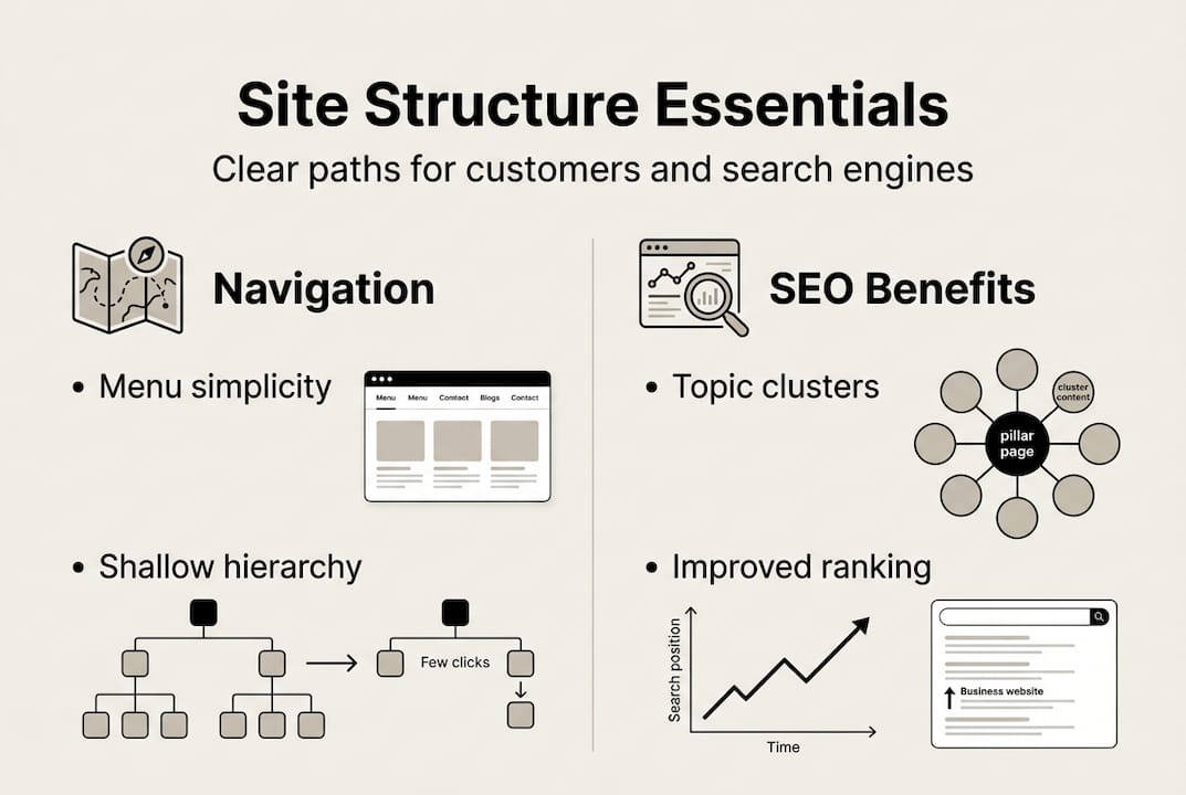
Best practices include a shallow hierarchy, user-centric labelling, and consistent navigation. This means keeping your most important pages no more than a few clicks from the homepage, using language your customers actually use, and making sure the menu looks and works the same way on every page.
If you’re planning a redesign, understanding the website design workflow from the start will save you a lot of rework later.
Key methodologies for organising your website
Knowing what site architecture is and actually improving it are two different things. Fortunately, there are proven methods that don’t require a developer to get started.
Key methodologies include content inventory, user research, card sorting, tree testing, taxonomy planning, and navigation prototyping. Let’s break these down into practical steps:
- Audit your content. List every page on your site. Note which ones get traffic and which ones don’t. Remove or consolidate pages that add confusion.
- Research your users. Ask your best customers what they look for when they visit your site. Even a quick five-question survey gives you gold.
- Card sorting. Write your main topics on cards (physical or digital) and ask customers to group them in a way that makes sense to them. This reveals how Kiwi customers actually think about your services.
- Map user journeys. Trace the steps a customer takes from landing on your homepage to completing an action. Spot where they might get stuck.
- Tree testing. Show users a text-only version of your menu and ask them to find specific information. This tests whether your structure works before you redesign anything.
- Prototype your navigation. Sketch or wireframe a new menu structure and test it with a small group before going live.
For a deeper look at how to handle content organisation steps for service businesses, it’s worth reviewing what works specifically for Auckland and NZ markets.
| Method | Best used when | Effort level |
|---|---|---|
| Content audit | Starting a redesign | Low |
| User surveys | You don’t know customer priorities | Low |
| Card sorting | Unsure how to group topics | Medium |
| Tree testing | Testing a new menu structure | Medium |
| Navigation prototyping | Before a full rebuild | High |
Pro Tip: Start with mobile users. Most Kiwi customers browse on their phones. If your navigation is clunky on mobile, you’re losing leads before they even read your content.
Best practices: building user-friendly structure and navigation
Once you’ve done the groundwork, it’s time to put best practices into action. These are the principles that separate websites that convert from ones that confuse.
Aim for a shallow hierarchy, meaning every page should be reachable within three clicks from your homepage. This keeps customers moving forward and reduces the chance they’ll give up and leave.

Here’s a quick comparison of good versus poor navigation features:
| Feature | Good example | Poor example |
|---|---|---|
| Menu labels | “Book a service” | “Solutions” |
| Page depth | 2 to 3 clicks from home | 5 or more clicks |
| Mobile menu | Large tap targets, clear layout | Tiny links, hard to tap |
| Breadcrumbs | Home > Services > Plumbing | No breadcrumbs |
| Search function | Visible and functional | Hidden or missing |
Use language your customers use, not industry jargon. If your customers call it a “quote” not an “estimate,” your button should say “Get a quote.”
Topic clusters are powerful for SEO for small business. Group related pages together under a main topic page. For example, a plumber might have a main “Services” page linking to “Hot water systems,” “Blocked drains,” and “Bathroom renovations.” This signals to Google that you’re an authority on these topics.
For local businesses, Google Local SEO benefits directly from a well-structured site. Clear architecture helps Google connect your pages to local search queries.
Key things to action right now:
- Use descriptive labels on every menu item and button
- Add breadcrumbs to all inner pages
- Test your site on a mobile phone before making any changes live
- Keep your main menu to seven items or fewer
Pro Tip: Ask someone who has never seen your website to find your contact page or a specific service in under 60 seconds. If they struggle, your structure needs work.
Site architecture for better SEO and conversions
Structure isn’t just about user experience. It directly affects how well your site ranks in search results and how many visitors actually become customers.
Topic clusters and clear hierarchies support both SEO and customer journeys. When your pages are logically grouped and linked, search engines can understand what your site is about and rank it more accurately for relevant searches.
Here’s what a strong site architecture delivers for your SEO and conversions:
- Faster indexing because search engine bots can crawl your site more efficiently
- Higher rankings for service-related keywords in your local area
- More internal links that pass authority between your pages
- Clearer calls to action because customers reach your booking or contact page without friction
- Lower exit rates on key pages because the next step is always obvious
- Stronger trust signals because a professional, organised site feels credible
For NZ small businesses, local trust matters enormously. When a customer in Auckland searches for a service and lands on a well-organised site, they’re far more likely to enquire than if they land on a confusing one. That first impression is your competitive edge.
You can see how this plays out in practice by looking at top design examples from service businesses that have nailed their structure.
Conversions improve when the path to action is short and clear. Every extra click you remove from the journey to your contact form or booking page increases the chance a visitor becomes a paying customer.
Practical steps for Kiwi small businesses to get started
Ready to take action? Here’s a straightforward process you can start this week, no coding required.
Start with user research via surveys or card sorts to match your local customer’s mental model. This is the single most valuable thing you can do before changing anything.
- List all your pages. Use a free tool like Screaming Frog or simply go through your site manually. Write down every page and its purpose.
- Identify your top five customer actions. What do most visitors want to do? Book, call, get a quote, read reviews? These actions should be the easiest things to find.
- Survey three to five customers. Ask them what they look for on your site and whether they’ve ever struggled to find something. Their answers will surprise you.
- Reorganise your main menu. Based on what you’ve learned, simplify your menu. Use plain language. Cut anything that isn’t essential.
- Create or improve topic clusters. Group related service pages under clear parent pages. Link them to each other naturally.
- Test on mobile. Pull out your phone and navigate your own site as if you were a new customer. Fix anything that feels slow or confusing.
- Get ongoing feedback. Add a simple feedback button or survey to your site. Real customer input is worth more than any expert opinion.
If you want professional guidance on the rebuild, check out professional services web design tailored for NZ service businesses.
Why strong site architecture is a game changer for NZ small businesses
Here’s something most web designers won’t tell you. A beautiful website with poor structure will underperform a plain website with excellent structure every single time.
We see it constantly. Business owners invest in new branding, fresh photography, and polished copy, then wonder why enquiries haven’t improved. The problem isn’t the visuals. It’s the bones underneath.
In New Zealand, mobile-first browsing is the norm. Kiwi customers are searching on their phones, often on the go, and they have zero patience for confusing menus or buried contact details. Every lost lead is real money walking out the door.
Strong architecture also makes your business more agile. When your site is logically structured, adding new services, changing your pricing, or pivoting your offer takes hours, not weeks. You’re not untangling a mess every time the market shifts.
Our honest take? Fix your structure before you spend another dollar on ads or a visual redesign. The gains in engagement and conversions will be far greater. For a deeper look at how structure and function come together, our engineering web design insights show exactly why this matters.
Treat your site architecture as a business asset, not a technical detail. It’s the foundation everything else is built on.
How Virtual Innovation can help elevate your website
If reading this has made you realise your site’s structure needs some serious attention, you’re not alone. Most Kiwi small business websites we review have at least three to five structural issues holding them back.
At Virtual Innovation, we specialise in WordPress designer NZ solutions and Shopify websites built specifically for New Zealand service businesses. We offer full website audits, architecture planning, and complete rebuilds that are practical, affordable, and designed to get you more enquiries. If you’re ready to stop losing leads to a confusing website, let’s talk. Our team at website design in Auckland is here to help you build something that actually works for your business.
Frequently asked questions
What is the main goal of site architecture?
The main goal is to help users find what they need quickly and easily by organising information clearly. Site architecture structures all information for quick and efficient navigation.
How many menu levels should my website have for best results?
Keep everything within three clicks from the homepage for a user-friendly experience. Best practices recommend a shallow hierarchy of three clicks maximum from the home page.
How does site architecture affect SEO for small businesses?
Clear website structure helps search engines understand your pages, making it easier to rank well and attract more visitors. Topic clusters and clear hierarchy directly support SEO and user engagement.
Can I improve my website’s architecture without technical skills?
Yes, start with content audits, simple surveys, and menu revisions that don’t require any coding knowledge. Simple methods like card sorting and user research are accessible to any business owner.