Why website speed matters: boost conversions and trust
Discover why website speed matters for NZ small businesses. Learn how faster load times boost conversions, build trust, and improve your Google r...

TL;DR:
- Your homepage can significantly increase conversions by improving clarity, trust signals, and speed.
- Effective homepage elements include clear headlines, strong trust signals, well-placed CTAs, and mobile responsiveness.
- Regular updates and focused improvements on your homepage deliver better ROI than complete redesigns.
Your homepage is your hardest-working salesperson. It works around the clock, greeting every visitor and deciding, in seconds, whether they stay or leave. For small businesses in New Zealand, getting this right is not optional. Conversion rate lifts of 0.9% to 2.7% are achievable simply by improving clarity and trust on your homepage. That might sound small, but across hundreds of monthly visitors, it adds up fast. This guide walks you through the essential homepage elements that turn browsers into buyers, so you can make smart, practical improvements without needing a full rebuild.
| Point | Details |
|---|---|
| Hero and value proposition | A clear headline and compelling hero image set the stage for higher conversion. |
| Trust signals matter | Showing reviews and credibility boosts customer confidence and drives action. |
| Optimise for speed | Fast-loading homepages greatly outperform sluggish ones in sales and engagement. |
| Meet all standards | Make your homepage accessible and mobile-friendly to reach every Kiwi customer. |
With the importance clear, let’s start with the most visible homepage element: the hero section.
The hero section is the first thing visitors see. It combines your main headline, a compelling visual, and a clear call to action. Get this right and visitors stay. Get it wrong and they bounce before scrolling.
Your headline needs to answer one question immediately: what do you do and who do you help? Visitors decide within five seconds whether your site is relevant to them. This is called the five-second rule, and it is brutally real. If your headline is vague or clever without being clear, you lose people fast.
A strong value proposition is short, benefit-focused, and specific. Compare these two examples:
The second version tells you exactly what, where, and why. That clarity drives action.
Here are the core elements every hero section needs:
Headline A/B tests lift conversions 10 to 20%, which means small wording changes can have a real commercial impact. It is worth testing two headline versions over a few weeks to see which one resonates.
Pro Tip: Run a simple five-second test by showing your homepage to someone unfamiliar with your business. Ask them what you do. If they cannot answer confidently, your headline needs work.
For businesses wanting a professional homepage design that covers all these bases, working with a specialist saves time and guesswork. You can also review the broader website feature essentials for NZ businesses in 2026. If you are building or refreshing a government-facing site, check the NZ government homepage standards for accessibility and mobile requirements.
After persuading with your headline, you need to demonstrate trustworthiness up front.

Visitors who land on your homepage are asking themselves: can I trust these people? Social proof answers that question before they even have to ask. It includes testimonials, star ratings, client logos, industry awards, and media mentions.
NZ audiences are particularly switched on to authenticity. A generic stock photo and a made-up quote will not cut it. Real names, real results, and real businesses carry far more weight.
“Trust signals are the backbone of any conversion-focused homepage.”
Adding trust signals can lift conversion rates by 0.9% to 2.7%, and the good news is that most of these are free to implement. You just need to ask your happy clients for a short testimonial.
Here is a breakdown of common credibility signals and their impact:
| Credibility signal | Example | Impact |
|---|---|---|
| Customer testimonials | Named quotes with photos | High: builds personal trust |
| Star ratings | Google or Trustpilot scores | High: immediate social proof |
| Client logos | Recognisable brand logos | Medium: signals experience |
| Industry badges | Trade association memberships | Medium: adds authority |
| Security certificates | SSL padlock, payment badges | Medium: reduces risk perception |
| Media mentions | Featured in NZ Herald | High: third-party validation |
Here are the trust signals worth prioritising on your homepage:
For inspiration on effective trust signals in action, see how trade businesses structure their credibility sections. You can also use a homepage features checklist to make sure nothing is missed.
Trust only works if customers know what to do next. Now focus on moving visitors toward action.
A call to action (CTA) is any button or link that tells a visitor what to do: book now, get a quote, call us, or start free. Without a clear CTA, visitors drift. With a strong one, they convert.
Here is how to structure your CTAs for maximum impact:
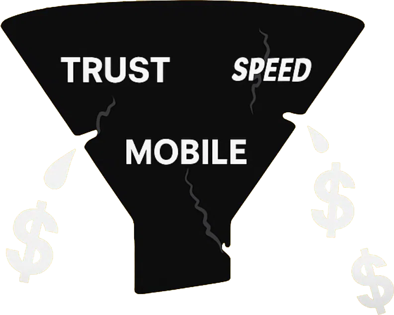
CTA changes can boost conversions by 10 to 21%, and load speed under one second converts 2.5 to 3 times better than slower sites. Speed is not just a technical detail. It is a conversion lever.
Here is a quick comparison of homepage setups and their likely outcomes:
| Element | Weak setup | Strong setup |
|---|---|---|
| CTA placement | Footer only | Hero, mid-page, footer |
| CTA language | “Submit” | “Get my free quote today” |
| Navigation | 10+ menu items | 5 or fewer clear links |
| Page load time | 4 to 6 seconds | Under 1 second |
| Mobile experience | Desktop version scaled down | Fully responsive layout |
Navigation should be simple. Five menu items or fewer keeps visitors focused. If your menu has ten options, most visitors will feel overwhelmed and choose nothing.
Pro Tip: Use a single consistent colour for all your primary CTA buttons. This trains the eye to find the action point quickly, no matter where visitors are on the page.
If you are ready to build your NZ website with these principles baked in from the start, the process is simpler than most people think. And if speed is a concern, read more about mobile website speed optimisation for NZ businesses.
Design excellence also means welcoming everyone. This is where accessibility pays off.
Accessibility is not just about ticking a compliance box. It is about making sure every potential customer, regardless of ability, can use your website comfortably. In New Zealand, government standards require accessibility and mobile usability for all websites, and the commercial case is just as strong.
Roughly one in four New Zealanders lives with some form of disability. That is a significant portion of your potential customer base. A site that is hard to read or navigate on a mobile phone is leaving money on the table.
Mobile responsiveness means your site automatically adjusts its layout for any screen size. This is not optional in 2026. Most NZ visitors browse on their phones first, and a site that looks broken on mobile signals unprofessionalism instantly.
Here is a practical accessibility and mobile checklist to work through:
For a deeper look at NZ web accessibility requirements and what they mean for your business, it is worth reviewing the risks and benefits in detail. And if your site is not yet responsive design for NZ audiences, that is the single highest-priority fix. You can also check the government accessibility guidelines directly for the latest requirements.
Here is a frank view from years of working with small Kiwi businesses: most of them wait far too long to update their homepage.
The common objection is cost. Business owners assume a refresh means a full rebuild, a big invoice, and months of back-and-forth. In reality, targeted improvements to your headline, trust signals, CTAs, and speed can deliver outsized results without a complete overhaul.
We have seen businesses double their enquiry rate by changing one headline and adding three testimonials. That is not an exaggeration. Small, focused changes to the right elements consistently outperform expensive ad campaigns in terms of return on investment.
Your homepage is a living asset. It should evolve as your business grows, your audience shifts, and your offer sharpens. Treating it as a one-off project is the biggest mistake we see. The businesses that treat their homepage as something to revisit every six months are the ones growing fastest.
If you are weighing up where to spend your marketing budget in 2026, read about website redesign growth and why it consistently outperforms other channels for NZ small businesses.
If this article has shown you anything, it is that your homepage has more untapped potential than you might have realised. The good news is that you do not need to fix everything at once.

At Virtual Innovation, we specialise in WordPress website design NZ and Shopify websites NZ that are built around the essentials covered in this guide: clear messaging, strong trust signals, fast load times, and mobile-first design. We work with Kiwi service businesses every day and we know what works. If you want expert eyes on your homepage, book a free assessment with a local WordPress designer and let’s find the quick wins together.
The headline and hero section are most critical, as they grab attention and communicate your value within the first few seconds. Headline A/B tests lift conversions 10 to 20%, making them the highest-leverage element to get right.
Show real testimonials with full names, display client logos, and add relevant industry badges or security certificates. Adding trust signals can lift conversion rates by 0.9% to 2.7%, and most of these improvements cost nothing to implement.
Aim for under one second. Sites loading under one second convert 2.5 to 3 times better than slower pages, making speed one of the most impactful technical improvements you can make.
Yes, absolutely. NZ government standards require accessibility and mobile usability across all websites, and beyond compliance, a mobile-friendly accessible site simply reaches more of your potential customers.