
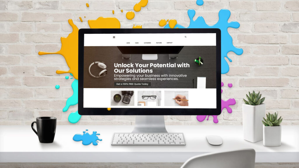
A slider can show several services or projects without turning the top of your homepage into a long list. It can also hide useful information behind controls that nobody notices.
Start with the job it needs to do. A visitor should understand your business even if they never move to the second slide.
Keep the main message outside the slider
Use a clear heading and introduction to explain the offer. Then let the slider show relevant services, products or examples. This keeps the essential message available while visitors explore at their own pace.
Our homepage uses that approach: the introduction explains the business, and the service panels let people look further into the work that interests them.
Give each slide one job
Choose one benefit, example or decision for each panel. A service slide might explain a common problem and link to the page that answers it properly. A project slide might show the work and offer a case study.
Keep detailed explanations on the destination page. If the slide needs several paragraphs before its point becomes clear, it may work better as a normal section.
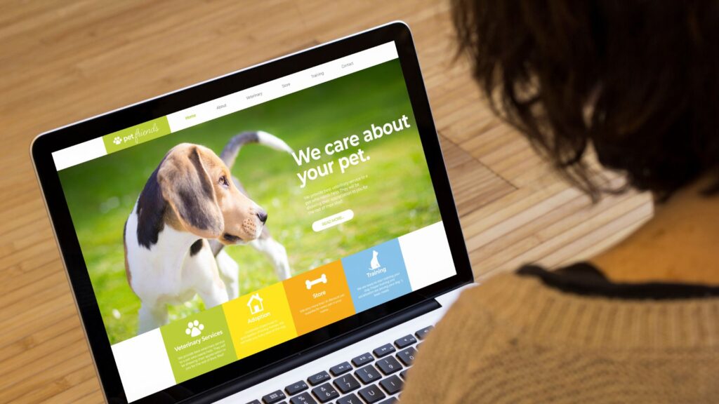
Design the mobile version deliberately
A desktop screenshot placed inside a phone-sized card can become unreadable. Decide what the image needs to communicate, choose a crop that preserves it, and leave enough room for the heading and controls.
Check short and long slides. Large fixed heights can leave an empty gap between the copy and image on some panels. At the other extreme, a card that is too tightly cropped can cut off a logo or a key part of the example.
A useful test is to read the panel on your own phone without zooming. Then swipe to the next panel and check that the page can still scroll naturally.
Make controls easy to understand
People need a clear way to move between panels and understand which one is selected. Swiping can be helpful, but it should not be the only option. Check keyboard use, visible focus and meaningful control labels.
If slides advance automatically, provide a way to pause them. Avoid moving content while somebody is trying to read or use it. The W3C carousel accessibility tutorial explains these requirements and why they matter.
Use real examples with useful context
A screenshot needs a reason to be there. Explain whether the project demonstrates clear service information, a simpler shopping journey or an easier way for the team to manage content.
For example, our Shopify website page includes retail examples, while the main website design page shows a broader range of websites. The destination helps people understand the work beyond the visual preview.
Keep the page responsive while images load
Use appropriately sized images and reserve space for them so the layout does not jump as they arrive. Test on a normal mobile connection as well as your office Wi-Fi. Loading every full-size screenshot at once can make a small carousel unnecessarily heavy.
Review what visitors actually do
A slider does not need an arbitrary number of panels. It needs a useful selection. Put the most helpful content first and remove repetition. If every panel says the same thing, a single clear section may do the job better.
Review whether people use the controls and continue to the relevant service or project. Compare this with the enquiries the site receives, rather than treating time spent watching animation as a result in itself.
A quick slider check
- Can someone understand your main offer without moving the slider?
- Does each panel have a clear purpose?
- Are text, logos and controls readable on a phone?
- Can people navigate with a keyboard and pause any automatic movement?
- Do the links lead to the right next step?
- Does the layout stay steady while images load?
If you need help with the wider page, our website design service starts with the customer journey and the content. The slider is one part of making that journey easier.