Table of Contents
Your website menu is like a road map for your visitors, and when that map becomes cluttered or confusing, people give up and turn back.
Many business owners spend time perfecting images and headlines but forget the quiet power of good navigation. It’s the first tool your audience uses to find their way, especially on mobile devices where space is limited and attention spans are shorter.
If your menu hasn’t been reviewed in a few years, it might be time for a check-up.
Why Your Website Menu Matters More Than You Think
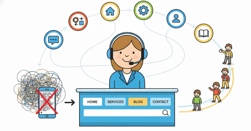
Think of your menu as the receptionist of your website. It greets visitors, shows them where to go and gives that all-important first impression.
A cluttered or hard-to-read menu can make your site feel overwhelming, even if the rest of your design looks great. On mobile, this problem becomes even more noticeable. Tiny text, too many dropdowns and long scrolling lists can frustrate users and send them elsewhere.
Good navigation makes people feel guided, not lost. It’s the invisible thread that holds your website together.
The Common Problems We See in Menus
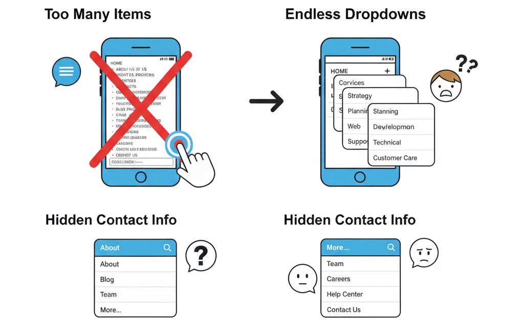
At Virtual Innovation, we often see the same menu mistakes appear across websites, especially when viewed on mobile.
Too many menu items are one of the biggest culprits. Businesses try to fit every page into the main navigation, creating a wall of text. What looks fine on desktop often shrinks into unreadable text on smaller screens. Dropdowns that open endlessly or overlap can cause frustration, and hiding contact options behind multiple clicks only adds to the problem.
If your customers are scrolling endlessly or can’t find what they’re after within seconds, your menu likely needs a tidy-up.
How to Simplify Your Menu Structure

A clear structure helps visitors feel comfortable and in control. Aim to keep your main navigation to around five to seven top-level links, with the rest placed in dropdowns or the footer.
Every item should serve a clear purpose. If a page doesn’t support conversions or provide key information, consider merging it or moving it elsewhere.
Group similar content together to make browsing easy. For example:
- “About” could include Our Story, Team and Careers
- “Services” might include Web Design, SEO and Hosting
Your visitors don’t want every option upfront, just the most logical path to follow.
Prioritise Mobile Experience

In New Zealand, more than half of website visits now come from mobile devices, yet many menus are still built with desktop users in mind.
Check how your navigation performs on smaller screens. Is the hamburger icon easy to tap? Does the menu text resize properly? Can users scroll without zooming or tapping the wrong link?
Test your site on different phones and tablets to get a true sense of the experience. What works on one device might not on another.
If you’d like to understand more about why mobile performance matters, our post Why Your Mobile Site Matters dives deeper into how design choices directly affect engagement and conversions.
Think About User Intent
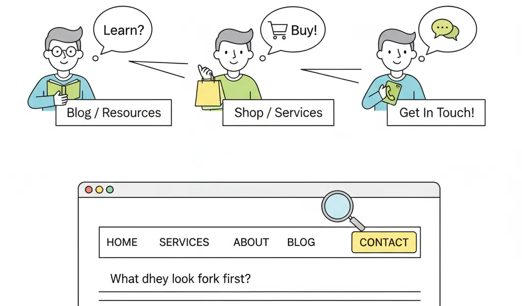
Every visitor comes to your website with a goal in mind. Some want to learn, some want to buy and others simply want to get in touch. Your menu should help them achieve that goal easily.
Ask yourself what people look for first, what the main action is you want them to take and whether that action is visible from every page. The easier the journey, the faster users say yes to your business.
Give Your Menu Some Breathing Room
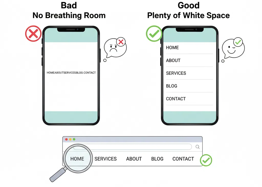
White space helps your design feel calm and trustworthy. Avoid cramming too many links close together. Add spacing so mobile users can tap without frustration. Simplicity builds confidence.
You can also use gentle visual breaks or dividers to group related links. A clean design makes for clear thinking.
Don’t Forget Accessibility
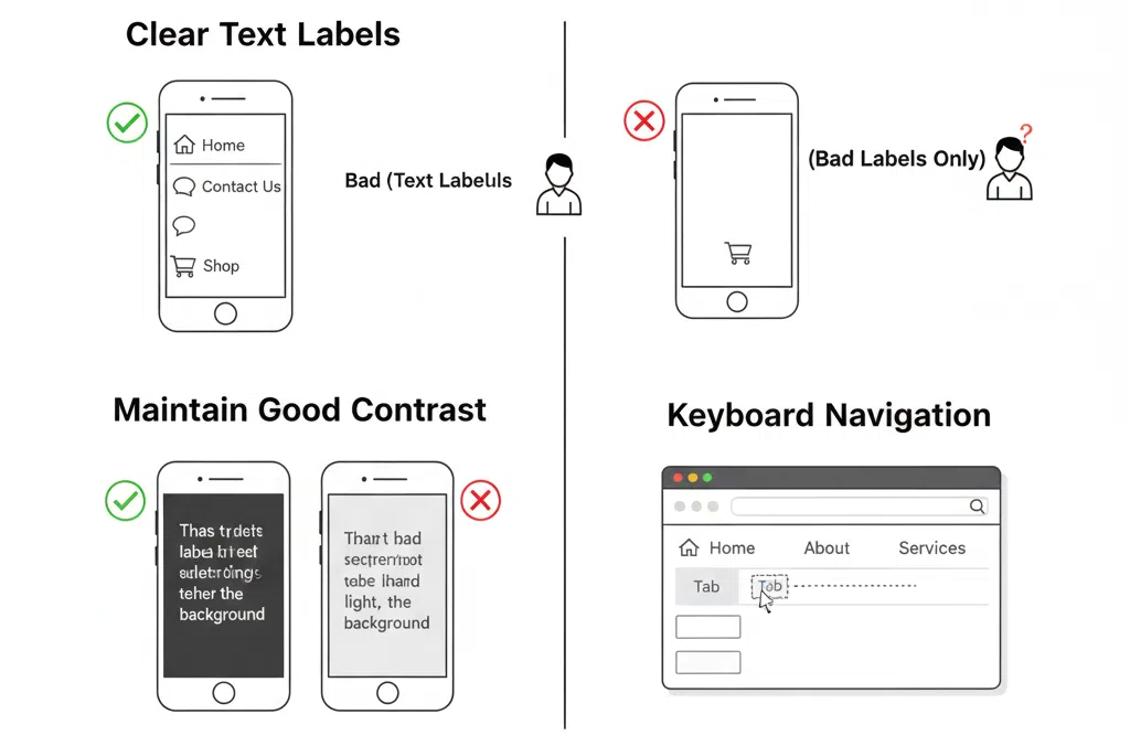
Accessibility ensures everyone can use your site, including those using screen readers or keyboard navigation.
That means using clear text labels rather than only icons, maintaining contrast between background and text, and avoiding menus that vanish when users try to click.
An accessible menu isn’t just considerate; it also helps your search rankings and strengthens your reputation as a professional, user-focused business.
Keep Your Call to Action in Sight
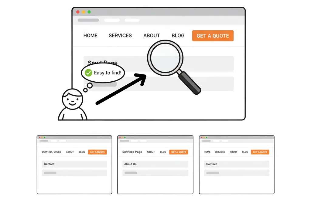
If your main goal is to encourage bookings, sales or enquiries, make that button stand out.
A “Book a Consultation” or “Get a Quote” link in your main menu gives users a clear next step. Keep it consistent across all pages so it’s always easy to find.
This approach works well on our own site, where we design calls to action that guide visitors naturally towards connecting with us.
Schedule a Regular Menu Review
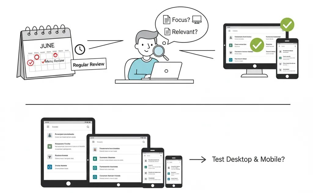
Menus grow over time as businesses add services, new pages or blog posts. A regular menu review helps keep things relevant and user-friendly.
Ask yourself if your business focus has shifted, whether all the pages still matter, and if the menu makes sense on both desktop and mobile.
For a deeper checklist on website maintenance, you might like our post Spring Clean Your Website which covers visuals, content and overall usability.
When to Bring in the Experts

If your navigation feels cluttered or confusing, or if your mobile menu is frustrating users, it might be time for a professional review.
At Virtual Innovation, we design websites that don’t just look great but work hard behind the scenes. Our focus is on smooth navigation, fast loading and designs that help visitors find what they need quickly.
Sometimes a few simple tweaks are all it takes to make a big difference. And when you’re ready for a full redesign, we can rebuild your navigation to improve clarity, usability and conversion.
Final Thoughts

A great website menu is almost invisible when it works. Visitors glide effortlessly through your pages without even realising they’re being guided.
But when the navigation is broken or cluttered, everyone notices. Confusing layouts and tiny mobile text can quietly cost you leads every single day.
Take some time this week to review your website menu. You may find small improvements that have a big impact. And if you’d like an expert eye on it, the team at Virtual Innovation is always happy to help.
Ready to make your website easier to use? Let’s chat about improving your navigation and user experience today.
💻 Need help with your digital presence?
We offer:
📞 Contact us today to elevate your brand online.
👉 [Book a Call Now] with our Auckland-based WordPress development team.


