

Choosing a childcare centre is personal.
For parents and whānau, it is not like booking a haircut or comparing a pair of shoes. They are trying to picture their child arriving in the morning, being welcomed by real people, settling into a new environment and growing in confidence over time.
That is why childcare centre website design needs a different mindset from a generic small business website.
The website is not there to impress other web designers. It is there to make a busy parent feel, often in a few quiet minutes on their phone, that this could be a safe, thoughtful and practical place for their child. It needs to show enough of the centre’s character to make a visit feel worthwhile, while making the basics easy to find.
For childcare centres, kindergartens, preschools, home-based early learning providers and ECE groups across New Zealand, that means getting the human part and the practical part right at the same time.
This guide is for centre owners, managers, marketing teams and early learning operators searching for childcare website designers in New Zealand. It explains what a website needs to do, what parents are quietly looking for, how to make enrolments easier and how to build a stronger foundation for Google and AI search without turning the site into a pile of jargon.
A childcare website starts the enrolment conversation before anyone calls
Most families will visit more than one centre website before they enquire. Some have been referred by a friend. Others are moving suburb, returning to work, looking for a better fit or trying to find availability for a particular age group and set of days.
They have questions, even if they do not type them into a search bar exactly like this:
- Is this centre near us, and does it fit our routine?
- Which ages does it cater for?
- What does a normal day feel like?
- Will my child be known as an individual?
- Who are the teachers and leaders?
- What is the learning approach in plain English?
- How do we visit, join a waitlist or start an enrolment?
- Can we get a clear answer without having to chase somebody?
A good website cannot answer every question. It should not pretend that it can replace a centre visit, a proper conversation or the relationship a family builds with kaiako. It can make the next step much easier.
The goal is simple: help the right family understand enough to book a visit with confidence.
That means a page should not open with a vague statement about “nurturing futures” and then hide every useful detail behind a contact form. Warm language is welcome, but it needs to be supported by the things people actually need to know.

What parents need to see in the first minute
When someone lands on a childcare website, the first screen should make the centre feel clear and real. It does not need every detail. It needs the essentials.
Start with a straightforward description of who the centre is for. For example, state the location, the age groups, the broad type of early learning environment and the next practical action. A parent should be able to tell whether it is worth reading further before they need to scroll through a long story.
The top of the website should answer five things quickly:
- Where is the centre? Include the suburb, street address or clear local service area, not just a name.
- Who does it support? State the age groups, rooms or stages that matter to families.
- What does the day feel like? Use real photography and specific writing, rather than a list of generic benefits.
- Why should a parent trust you? Show the people, the environment, a clear learning approach and useful credentials or reviews where appropriate.
- What can they do next? Make it obvious whether the right action is booking a visit, checking availability, joining a waitlist, calling or sending an enquiry.
It is surprising how often one of these is missing. A centre may have beautiful photography but no clear enrolment path. Another may have an online form but no explanation of what happens after it is sent. Some tell a detailed philosophy story but make parents work hard to discover what ages they accept or which days they open.
Clarity is reassuring. It is one of the best forms of conversion design in this sector.
Make the learning approach understandable, not abstract
New Zealand early learning centres have a strong opportunity to explain their approach with more depth than a generic childcare website. The key is to write it in a way that makes sense to a parent who is not immersed in education terminology.
Te Whāriki is Aotearoa New Zealand’s early childhood curriculum. It is play-based and brings together the experiences, activities and relationships that shape a child’s learning. That gives a centre a useful starting point, but simply placing the words “Te Whāriki” on a page is not enough.
Show what it looks like at your centre.
If your children spend time outdoors, describe the kind of exploration that happens there. If kaiako use storytelling, music, loose parts, baking, gardening, art, movement or local walks, show it. If the centre has a genuine commitment to te reo Māori, local stories or a particular community connection, explain how that appears in everyday life.
This is where real photographs and specific writing do more work than a polished slogan. They help whānau imagine the experience their child may have.

A practical way to explain your philosophy
Instead of writing, “We offer a child-led, holistic learning environment,” show parents what that means:
- Children can choose from a prepared range of activities and teachers respond to their interests.
- A small group may investigate leaves, water and insects in the garden with a kaiako nearby to extend the conversation.
- The centre may use familiar songs, words and stories from the children’s communities.
- Teachers may share learning stories so whānau can see the thinking behind a child’s play.
Those details are more believable because they are specific. They also give search engines clearer text to understand than a page full of broad claims.
The Ministry of Education describes Te Whāriki as a framework for local curricula that reflect each setting’s distinctive character and values. Your website is a good place to explain that local character without copying a curriculum document word for word.
Real people and real environments build trust faster than stock language
Childcare is relationship-based. Families are entrusting a centre with a huge part of their child’s week. A website needs to look and feel like real people will be there when they arrive.
That is why centre photography matters so much.
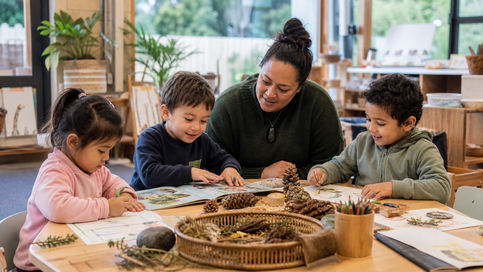
If possible, use genuine images of the centre, its spaces and its team, captured with proper family permissions. Show children engaged in normal, positive learning experiences. Show rooms at a useful scale. Show outdoor spaces. Show the people who greet families, teach children and lead the centre.
Not every image needs to have a smiling child looking directly at the camera. In fact, candid moments often feel more trustworthy. A child concentrating on a project, a teacher listening carefully, a group preparing for outdoor play or a parent being welcomed at the door can say far more than a staged line-up.
You should also introduce the adults behind the service. A short profile for the centre manager, owner or educational leader can help. Name the people, explain their experience in a calm, human way and make it easy for a prospective parent to see that there is a real team behind the brand.
For a multi-site group, do not hide every centre behind one national story. Give each location its own page, its own imagery and the relevant local team where possible. Families want to know about the centre their child may actually attend.
Design the enrolment journey around real parent behaviour
The enrolment process does not begin with a long form. It usually begins with a parent trying to work out whether the centre could be right for their family.
The Ministry of Education notes that parents can arrange a visit before they enrol and that services may have their own enrolment processes, fees, minimum weekly hours and availability. A useful website should set expectations clearly without making every visitor fill in sensitive information too early.
Think of the process in stages.
Stage one: help people self-select
Give visitors a quick way to see the essentials: location, age groups, opening hours, the centre’s general approach and whether the centre is accepting enquiries or operating a waitlist. You do not need to promise spaces that are not available. You do need to avoid sending people on a dead-end journey.
Stage two: make a visit feel easy
For many centres, a centre visit is the best next step. A clear “Book a visit” or “Arrange a tour” call to action can work well when it explains what happens next. Will someone call them? Can they choose a time? Should they bring their child? Is there a usual duration?
The wording should be practical and friendly. “Come and meet the team” is usually more useful than a hard-selling button with no explanation.
Stage three: collect only the information you need
An early enquiry form may only need a parent name, a reliable contact method, the child’s age range, preferred days and a short message. That is enough to start a helpful conversation.
Do not ask a parent to submit a complete medical, family or enrolment profile through an early website form unless there is a clear reason and a properly designed process behind it. The more a form asks for, the more likely people are to pause or abandon it. It also creates more responsibility for the centre to handle that information appropriately.
Stage four: follow up like a human
The best website in the world will not save a slow or confusing response after an enquiry. Make sure the form goes to the right people, acknowledges the request and gives the team enough context to respond usefully. A simple internal process is much more valuable than a complicated automation nobody checks.
This is the kind of work we think about when building WordPress websites for service-based organisations. The website and the team workflow should work together, not become two separate problems.
The information parents do not want to hunt for
Parents can accept that a centre will have rules, processes and limited availability. What frustrates them is being unable to find the basic facts.
Every centre will be different, but a useful childcare website normally gives clear access to:
- the address, map and parking or drop-off guidance where helpful
- opening hours and contact details
- age groups, rooms or programmes
- the enrolment process and current availability approach
- what to bring and what the centre provides
- meal, sleep, settling or nappy information where relevant
- fee information, funding guidance or an honest explanation of how to get a quote
- illness, medication or communication policies where the centre chooses to publish them
- a privacy policy and terms that match the real process
- centre news, events and closure dates if they are kept current
You do not need to put all of this on the homepage. Use a clear navigation and an FAQ section so parents can find the answer without opening six pages.
When the information is current, it reduces repetitive calls and gives the team a better starting point for conversations. When it is old, it does the opposite. Review dates, staff photos, room names, fees, hours and forms regularly. A tidy website tells a parent the operational side of the centre is likely to be considered too.
Mobile usability is not a nice extra
Childcare research often happens between everything else. A parent may be on the bus, in a car before work, awake with a child early in the morning or acting quickly after a recommendation from another parent.
That means mobile is often the real version of the website.
Check the practical things:
- Is the main message readable without zooming?
- Can someone tap to call from every important page?
- Do images load quickly and fit the screen without being cut off?
- Are buttons large enough to tap with one hand?
- Does the booking or enquiry process work on a normal phone connection?
- Is the map easy to open in a navigation app?
- Can a visitor get the address, hours and contact details in seconds?
Designing for mobile also improves the desktop version. It forces the website to respect a visitor’s time and make the next action obvious.

Local search: help the right families find you
Parents rarely search for a broad phrase like “a nice early learning centre”. They tend to include a location, an age group, a specific need or the language they use at home.
Common searches might include:
- childcare centre in [suburb]
- preschool near [suburb]
- infant care in [suburb]
- early learning centre near me
- kindergarten [suburb]
- childcare with extended hours [area]
- childcare centre with outdoor play [area]
You do not need to produce hundreds of thin pages with suburb names swapped out. That is not useful for families and it is not a sustainable search strategy.
Instead, build a strong core:
- Give every physical centre its own genuinely useful location page.
- Use accurate addresses, phone numbers, maps, opening hours and local images.
- Explain the age groups, the team, the practical enrolment path and what makes that centre distinct.
- Keep your Google Business Profile and key directory details aligned with the website.
- Publish useful resources that answer common parent questions.
- Use logical links between the homepage, centre pages, enrolment information, curriculum pages and contact options.
That is the foundation of sensible search engine optimisation for a childcare centre. It is about clear, credible information first. Better rankings are the result of doing many things well over time, not a button you can buy once.
Privacy and child information deserve careful thought
Childcare websites often lead into the collection of personal information. This needs a calm, practical approach.
For an early enquiry, ask only for what the team needs to respond. If you are collecting more detailed information later, make sure the form, storage, access, handover and retention process suits the centre’s privacy obligations and the systems it uses.
The website should make its privacy information easy to find and use clear language. A parent should understand why information is being requested and what will happen next.
The Ministry of Education’s enrolment guidance explains that a centre may need information such as identity documentation and medical details during enrolment. That is different from asking every website visitor for every detail at the first point of contact. A well-designed journey respects that difference.
The right setup may involve a secure enrolment platform, a student management system or an agreed internal process. It depends on the service. The important thing is that the public website, enquiry forms and operational systems are deliberately connected rather than bolted together later.
A childcare website should be easy for the centre to run too
It is tempting to focus only on the parent-facing side. But an impressive website that the team is afraid to update will become a problem quickly.
Before a rebuild, decide what the centre needs to change without a developer. That may include:
- holiday closures and event notices
- team profiles and vacancies
- room pages and age ranges
- photo galleries with the right permissions
- downloadable parent information
- articles and practical resources
- availability messages or waitlist information
- new locations as the organisation grows
The best platform depends on the way the centre works. For many centres, WordPress gives staff a flexible way to maintain pages and resources with sensible training and support. A smaller centre may need a leaner build with fewer moving parts. A group with multiple centres may need a clearer content structure, permissions and a reliable plan for keeping each local page current.
Whatever the platform, the centre should have ownership of the basics and a support team available for the technical work. Good website design is not about creating dependence. It is about giving people the right level of control.
Case study: keeping Haven Early Learning premium and practical
Early learning businesses do not always have unlimited website budgets, but they still need a presence that reflects the care and quality behind the service.
For Haven Early Learning, the team had purchased a new centre and wanted to create a brand and website around their own vision, beliefs and style. They wanted something clean, sharp and straightforward to manage, without compromising on how it felt to prospective families.
The result was a premium-feeling website shaped around the centre’s branding and practical needs. It gave the team a stronger platform for marketing the new concept, while keeping the content manageable after launch. That balance is important. A childcare website should look considered, but it also needs to be useful to the people answering enquiries, updating the site and welcoming families each day.
You can see more examples of work shaped around an actual business need in our case studies.
What to ask a childcare website designer before you commit
There are plenty of agencies and freelancers who can make a website look pleasant. The better question is whether they understand the practical job the site needs to do after launch.
Ask prospective childcare website designers:
- How will you help us work out the most important parent journeys?
- How will the site make visiting or enquiring easy on mobile?
- How will we show our philosophy in a way that is genuine and easy to understand?
- How will each centre appear in local search without creating duplicate content?
- What will our team be able to update ourselves?
- How will you handle photography, image permissions and accessibility?
- What happens to website enquiries after somebody submits a form?
- How will the website stay fast as we add images, pages and resources?
- What training and support is available after launch?
- How will the site be measured and improved over time?
The answers should be plain, practical and relevant to your team. If every answer is a technical acronym, you are probably being sold a process rather than being helped to solve the problem.
The best childcare websites make a centre feel easier to choose
The aim is not to make a childcare centre website noisy, overdesigned or overly clever.
It is to make it easier for a family to understand the centre, imagine the everyday experience, see the people behind it and take the next right step. It is to give the team a website that supports enrolments rather than adding more admin. And it is to give Google and AI search tools a clear, trustworthy source of information about what the centre offers and where it is based.
When those things come together, the website becomes more than a brochure. It becomes a useful part of the relationship with prospective families.
If your childcare centre website is dated, hard to update, slow on mobile or not bringing in the right enquiries, talk to Virtual Innovation. We can help you work through what is worth improving first, then build a clear plan around the parents and whānau you want to reach.