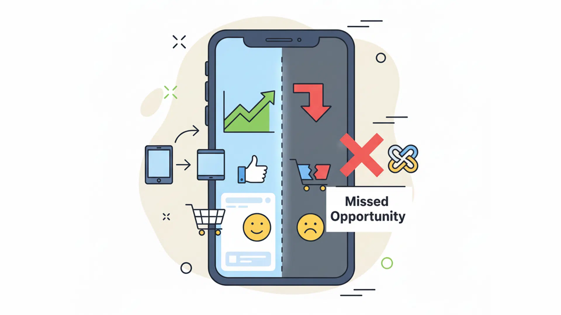
Table of Contents
If your website does not work well on mobile, you could be losing more customers than you realise.
It is easy to assume your site is “good enough” just because it looks fine on a desktop. But here is the reality: more than half of all website traffic now comes from mobile devices, and that number keeps growing.
According to Statista, mobile traffic accounts for over 58% of global website visits and in New Zealand, mobile use has been rising steadily, especially among small business customers searching on the go.
Yet many websites are still designed for desktop first, with mobile treated like a side project.
That mindset needs to shift.
What Is Mobile-First Design?

Let’s clear something up. “Mobile-first” doesn’t mean ignoring your desktop site.
At Virtual Innovation, we build websites that look great on desktop, but we plan for mobile from the very beginning. Why? Because most of your visitors are switching between phones, tablets and laptops throughout the day.
So instead of designing for a big screen and hoping it works on mobile, we think about both at the same time. We make sure your most important content, features and calls-to-action are just as clear on a phone as they are on a widescreen monitor.
It is about balance. Great design that adapts smoothly across all devices. No pinching, no zooming, and no frustration.
If your current site feels stuck in desktop mode, you might be due for a refresh. We talk more about mobile-friendly design in this article, it’s a great place to start if you’re unsure whether to rebuild or improve what you’ve already got.
What Happens When Mobile User Experience Is Poor?

Your site might look fine on desktop, but if mobile visitors are:
- Pinching and zooming just to read the text
- Struggling to tap tiny “Book Now” or “Contact” buttons
- Confused by complex menus
- Watching overlapping images hide important content
- Waiting more than 5 seconds for the page to load
…they’re probably not sticking around.
In fact, Google data shows that 53% of mobile users will leave a site if it takes longer than 3 seconds to load. That’s a huge missed opportunity if you rely on your website to bring in leads or bookings. We talk more about that in The Hidden Cost of Slow Websites.
Google’s Mobile-First Indexing: What That Means for You

Since 2019, Google has been using mobile-first indexing. This means it looks at your mobile site first when deciding how to rank your website in search results.
If your mobile version is missing content, has a broken layout, or loads slowly, you might lose rankings, even if your desktop site is perfectly designed.
To check your current mobile performance, we recommend Google’s Mobile-Friendly Test. It gives you a simple pass/fail score and shows any key issues.
Another great tool is PageSpeed Insights by Google, which gives you separate mobile and desktop scores, with suggestions on how to improve each.
What Makes a Great Mobile Site?

Here’s a checklist we follow with every mobile-friendly build:
✅ Loads in under 3 seconds on mobile data
✅ Adjusts cleanly to all screen sizes
✅ Large buttons and clickable areas
✅ Mobile-friendly fonts (at least 16px)
✅ Simple, fast navigation
✅ No content overlap or weird stacking
✅ Strong contrast for outdoor readability
✅ Clear call-to-actions, always visible
✅ Tap-to-call and tap-to-email enabled
Mobile users want answers fast. If your website makes them think too hard or wait too long, they’ll move on.
Signs Your Mobile Website Isn’t Doing Its Job
Not sure if your site is mobile-optimised? Look for these signs:
- You rarely get enquiries outside office hours
- Your bounce rate is high on mobile traffic (check Google Analytics)
- You’ve never viewed your site on a modern smartphone
- You have to zoom to click a button
- Someone told you “your site’s hard to use on mobile” and you brushed it off
- You’re not ranking well on mobile search terms
If any of these ring a bell, it might be time for a refresh. If you’re unsure whether to rebuild or just improve what you’ve got, check out our guide: Does My Website Need a Design Refresh?
Next-Level Mobile Features That Drive Conversions
These days, almost everyone has a smartphone. Most people are browsing, researching, and even buying from their mobile devices. If your website is already mobile-ready, that’s great, but there are always ways to take it further.
Here are a few modern mobile upgrades we’re seeing work well right now:
Sticky CTA bars
A persistent footer bar with a single call-to-action (like “Call Us” or “Book a Free Chat”) can boost mobile enquiries. It stays visible while people scroll and keeps action just a tap away.
Live chat or messaging apps
More businesses are adding live chat tools or integrating WhatsApp and Messenger. People are comfortable tapping to ask a quick question, especially when they’re on the go.
Expandable FAQs
Mobile users tend to scan, not read. Collapsible FAQ blocks make it easier to navigate and find answers without endless scrolling. They also help reduce support queries and improve SEO.
Smart, mobile-only popups
Consider using a popup that appears only on mobile after a short delay or scroll for example, “Tap here to book a call.” Keep it simple, clear and relevant to the visitor’s intent.
Even if your site is a year or two old, small additions like these can add real value without requiring a full rebuild. It’s about making the mobile experience more interactive, easier to use, and more focused on helping people connect with you.
Mobile Design Builds Trust, Too
Here’s something business owners don’t always think about: how your website looks and works on mobile directly affects trust.
If your mobile site is clunky, outdated or hard to navigate, visitors may assume your business is the same.
First impressions matter, and your mobile site might be the very first experience someone has with your brand.
On the flip side, a smooth mobile experience instantly communicates:
- Professionalism
- Attention to detail
- Credibility
- A customer-first mindset
That’s what turns casual visitors into actual leads.
Quick Fixes You Can Do Today
Want to improve your mobile site without touching code? Here are 5 practical, DIY steps:
- Check your homepage on your phone
What shows up first? Is your message clear in the first 3 seconds? - Move your key call-to-action higher up
Try placing “Call now”, “Enquire today”, or “Book a free review” in the top section. - Reduce image sizes
Use TinyPNG or ShortPixel to speed up loading times. - Simplify your navigation
Stick to 4–6 key links and test them on different screen sizes. - Add click-to-call buttons
Make sure mobile users can reach you with one tap.
Why It Matters for Business
Here is the big picture: your mobile site is not a “nice-to-have” anymore.
It is where the majority of your audience is seeing your business for the first time.
If your mobile experience is clunky or outdated, it could be the reason people are not enquiring, not booking and not converting.
A few simple changes today can turn mobile traffic into real leads without spending a dollar on extra ads.
What If You’re Not Sure Where to Start?
That is where we come in.
At Virtual Innovation, we help Kiwi businesses improve their websites so they actually work, not just look good. We offer a free strategy session where we:
- Check how your site performs on mobile
- Give you honest, non-techy feedback
- Recommend quick wins you can do yourself
- Or help with a full mobile-friendly redesign if needed
There’s no pressure, just good advice and a clearer path forward.
Book your free website review, it could be the easiest improvement you make this year.
📞 Talk to us about the Growth Builder package today
💻 Need help with your digital presence?
We offer:
📞 Contact us today to elevate your brand online.
👉 [Book a Call Now] with our Auckland-based WordPress development team.