Table of Contents
Let’s be real. You’ve got about 5 seconds to win someone over when they land on your site. If your homepage doesn’t instantly show who you are, what you do, and why they should care… they’re gone. No enquiry. No sale. No second chance. To help you capture attention, focus on the homepage hot zone.
That’s why we put together the 5 hot zones your visitors look at first, including the homepage hot zone. Get these right and your homepage will work harder for you. Most of this you can do yourself. And if you need a hand, we’re always here at Virtual Innovation.
Understanding the Homepage Hot Zone
The homepage hot zone is crucial real estate for engaging visitors. This area serves as the first touchpoint where users decide whether to explore further or leave.
1. Hero Section (Above the Fold)

This is your first impression. It’s like your elevator pitch but visual.
What to nail:
- Headline that clearly says what you do
- One-liner that tells people who it’s for or the outcome they’ll get
- An image that reflects your brand or service in action
Kiwi example: Instead of “Excellence in Construction” try “We Build Custom Homes for Kiwi Families, On Time and On Budget.”
???? Small tweaks to your hero headline or image can double the time someone stays.
2. Your Tagline and Unique Value

Straight after the hero, you need a clear statement of what makes you different.
Keep it short. One sentence max. No buzzwords. No fluff.
If you’re stuck, ask your clients why they picked you. Use their words.
Example: “Helping South Island businesses grow online since 2010.”
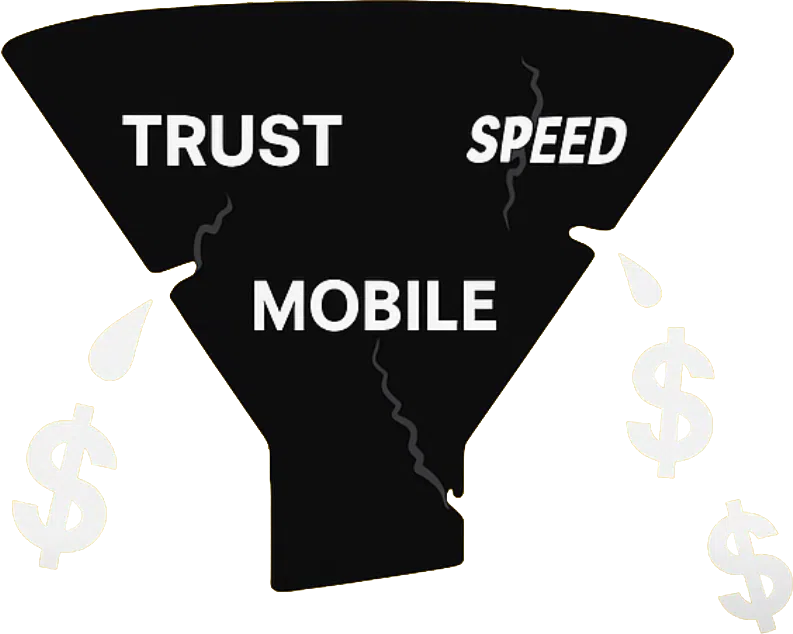
3. Trust Signals

People won’t believe you until they see proof. Show reviews, client logos, or a quick case study.
What to add:
- Testimonials with names and photos
- Google reviews embedded on your homepage
- A client logo wall
- A short success story
Kiwis love word of mouth. Your website should give off the same trust.
4. Clear Calls to Action

Once you’ve got attention, tell them what to do. Don’t leave them guessing.
What works:
- A bold button above the fold (“Book a Free Chat” or “Get a Quote”)
- Repeat it further down the page
- Offer a softer step too, like “See Our Work”
Make it obvious. Use colour contrast and action-driven wording.
5. Easy Navigation and Mobile Layout

If people can’t find what they need, they’re gone. And most will be on mobile.
Checklist:
- Simple nav (Home, About, Services, Contact)
- Sticky menu on mobile
- Fast load time (under 3 seconds)
- Clean, clickable layout
Attention spans are short. Keep it simple.
Bonus: 10-Minute Audit
Grab a mate who knows nothing about your site. Ask them to:
- Tell you what your business does in 5 seconds
- Find your contact details
- Share one thing they liked and one thing that confused them
You’ll spot problems fast. Free user testing.
Ready for the Next Step?
At Virtual Innovation, we build NZ websites that don’t just look good. They work.
That means:
- Clear messaging
- Trust built straight away
- Easy next steps for visitors
If your homepage needs a refresh or a full rebuild, we can help. Check out our recent projects or book a quick strategy chat with our team.
???? Need help with your digital presence?
We offer:
???? Contact us today to elevate your brand online.
???? [Book a Call Now] with our Auckland-based WordPress development team.