Table of Contents
Your homepage slider or hero carouse is the first thing many visitors see. It’s prime real estate, but most businesses don’t use it to its full potential. If your slider isn’t clear, mobile-friendly, or strategically focused, it could be costing you leads.
In this article, we’ll break down the top homepage slider best practices, including what to include, what to avoid, and how to create a slider that truly adds value to your customers—whether you’re doing it yourself or reaching out for help.
Why Your Homepage Slider Matters
Your homepage slider is one of the first things users see when they land on your site. When done right, it can:
- Communicate your value instantly
- Guide users toward the right pages
- Improve the user experience
- Boost engagement and conversions
- Set a strong first impression
But when it’s cluttered, unclear, or slow to load, it can do more harm than good.
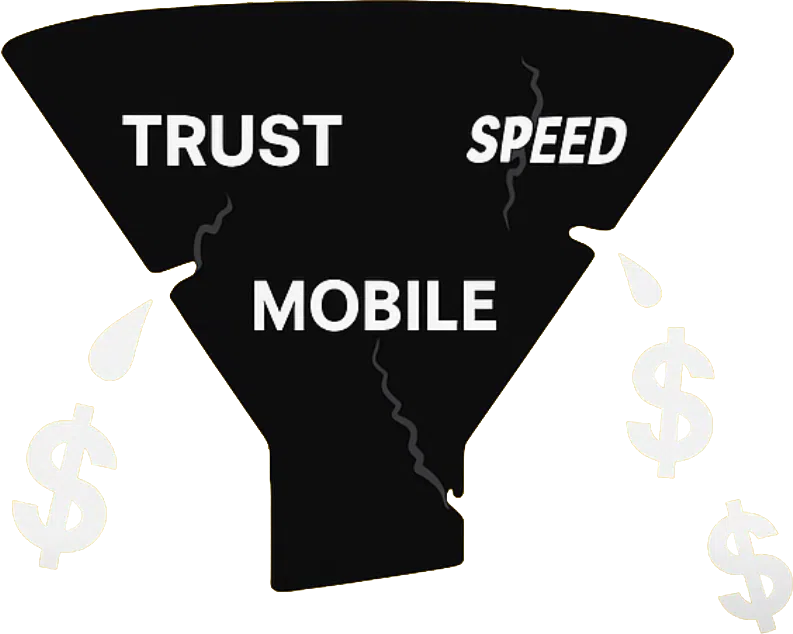
???? One of the most common reasons why visitors leave your site is confusion—they can’t figure out what you do or where to go next. A poorly designed slider often plays a big role in that drop-off.
By following homepage slider best practices, you create a smoother, more purposeful experience that encourages visitors to stay, explore, and take action.
What to Include in Your Homepage Slider

1. Clear Value Proposition
Your first slide should answer:
What do you offer, and why should the visitor care?
Example:
“Helping NZ businesses grow online with high-converting websites.”
Use strong headlines with supporting subtext, and avoid internal jargon.
???? Tip: Talk to your customer’s pain point, not just about your services.
2. Strong, Focused Calls-to-Action
Each slide needs a purpose—and that purpose should lead somewhere. Use one clear CTA per slide such as:
- “Book a Free Strategy Call”
- “Explore Our Services”
- “Get a Website Performance Scorecard”
This aligns with slider design for conversions, not just aesthetics.
3. Limit to One Message Per Slide
Trying to say too much = no message gets through. Instead, break it down:
- Slide 1: Value proposition
- Slide 2: Client success or testimonial
- Slide 3: Offer or lead magnet
This is a homepage carousel tip that keeps things clear and purposeful.
4. Mobile-First, Fast-Loading Design
With mobile traffic dominating, your homepage slider must:
- Be readable on small screens
- Load fast to reduce bounce rates
- Have tappable buttons
???? Test your slider with tools like Google PageSpeed Insights and on real devices.
5. Visually Clean and On-Brand
Use on-brand images and avoid generic stock photos. Make sure:
- Text contrasts well with background
- Images are high quality but compressed
- You stick to your visual identity
Website slider content ideas work best when they’re backed by design consistency and clarity.
What to Avoid in Your Homepage Slider
1. Too Many Slides
Most users never see beyond the 2nd or 3rd slide. Having more than 3 reduces impact.
Stick to fewer slides with more focus—quality over quantity.
2. Low-Value or Internal Content
Avoid slides like:
- “Welcome to our website”
- “We started in 1999”
- “Follow us on TikTok!”
These don’t drive value or help your visitor take action.
3. Slides Without a CTA or Purpose
Pretty images without action are wasted space. Every slide should have a clear message and next step.
4. Slow or Over-Animated Slides
Flashy animations might look fun but often:
- Hurt mobile performance
- Increase page load times
- Distract instead of convert
Stick with clean transitions that don’t block user interaction.
5. Cluttered Design and Tiny Text
The best homepage sliders are simple, bold, and readable. Avoid:
- Long paragraphs
- Small fonts
- Multiple buttons per slide
Use hierarchy and whitespace to guide the eye.
???? Why Following Homepage Slider Best Practices Is Worth It

A well-optimized slider can:
- Boost engagement and time on site
- Improve conversion rates
- Guide users through your website journey
- Build instant credibility
- Contribute to better SEO and mobile usability
Even better? You don’t need a full site redesign—just a smart refresh based on strategy and insight.
???? DIY Slider Improvements You Can Make Today

If you’re managing your website solo, here are some quick wins:
- Audit your current slides: Are they helpful or just visual clutter?
- Use heatmaps like Hotjar to see if users click your sliders.
- Redesign using Canva or Figma with one message per slide.
- Add clear CTAs and test them regularly.
- Compress your images for speed using TinyPNG or similar tools.
- Make sure your slider is swipeable and legible on mobile.
Want Help? We Can Do It With You
If you’re unsure whether your homepage slider is helping or hurting, we’d love to help.
At Virtual Innovation, we specialise in designing conversion-focused websites—starting with strategic changes like better hero sections and CTAs.
???? Explore our Website Design Auckland services or see how we support business website development for growth-minded clients.
???? Need help with your digital presence?
We offer:
???? Contact us today to elevate your brand online.
???? [Book a Call Now] with our Auckland-based WordPress development team.


